Summary
Velvet (from the late Latin word vĭllūtus): a silky, rich material; a symbol of power and wealth.
I created this project from my frustrations. I found myself forgetting to pick up more tampons before my cycle began or being disappointed with products. When I began doing research on how other women felt about their periods and feminine products, I found a lot of similarities. Most women just want something that is comfortable, low cost, and fits their needs. Periods are hard enough, Velvet is designed to make periods easy.


Objective
-
Cater to every women’s monthly needs and deliver the product just in time, like clock work in a monthly care package.
-
It’s time we modernize periods and make sure we are tracking, comparing, and consuming the right products for our body.
-
Complete my 2020 Graduate Capstone Project


2020
Velvet

01
Researching the Audience
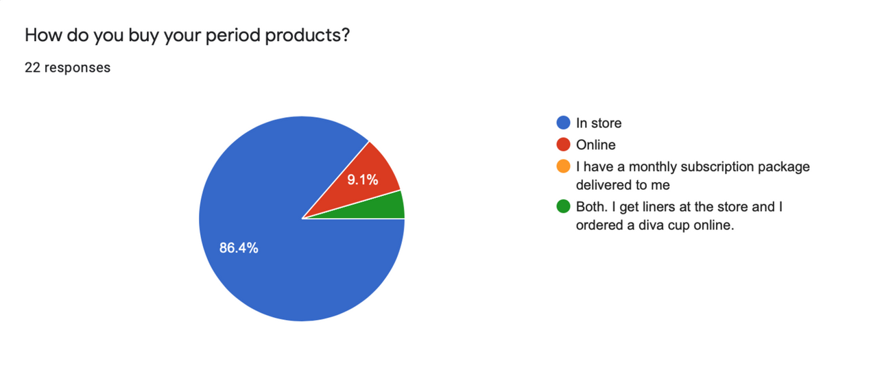
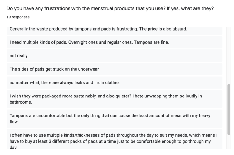
A questionnaire was sent to a group of women to conduct research on areas of frustration with their menstrual cycle experience.
02
The Personas
From that research user personas were created from the results to better frame who the target consumer would be.
03
The Product
The Velvet experience was born! Starting with the mobile app UX/UI and designing a monthly subscription delivery crate.

Build a profile and track your health
The user would be able to build out their personal profile and track their cycle. This data would be used to send out notification on delivery updates so they can get their products on time and help them stay organized.

Browse products right for you.
The user would be able to simply browser the market. Allowing them to create reviews and compare products available to them all on their phone

Have them delivered just in time.
When the user is ready to purchase they can add the item to their cart for a one time purchase or add to their crate for a monthly subscription box.


